10 Reasons Why Quality Website Design is Crucial for Business Success in 2024
Are you struggling to attract and retain customers online?
Your website design might be the problem. The design quality of your website can make or break your business success.
Here are 10 compelling reasons why investing in top-notch website design is crucial for your business success.
First Impressions Matter
Visitors form an opinion about your website within seconds.
A poor design can instantly drive potential customers away.
A high-quality, professional design ensures a positive first impression.
Key Tips:
- Use a clean and modern layout.
- Ensure fast loading times.
- Make navigation intuitive.
Mistakes to Avoid:
- Overloading with too much information.
- Using outdated design elements.
- Ignoring mobile responsiveness.
Example: A sleek, minimalistic website like Apple’s homepage immediately conveys professionalism and quality.
Builds Credibility and Trust
Users may question the legitimacy of a poorly designed website.
Lack of trust can lead to high bounce rates and low conversions.
A well-designed website builds credibility and trust with visitors.
Key Tips:
- Use high-quality images and graphics.
- Include customer testimonials and case studies.
- Maintain consistent branding throughout the site.
Mistakes to Avoid:
- Using low-resolution images.
- Refrain from updating outdated information.
- Inconsistent branding.
Example: Trustworthy websites like Amazon or Airbnb have consistent branding and high-quality visuals that gain user confidence. You can also read essential components of good landing page .
Enhances User Experience
Complicated navigation frustrates users.
Frustrated users leave the site quickly, increasing bounce rates.
A good design makes the user experience smooth and enjoyable.
Key Tips:
- Simplify navigation menus.
- Use clear call-to-action buttons.
- Optimize for mobile devices.
Mistakes to Avoid:
- Overcomplicating menus and links.
- Using small, hard-to-read fonts.
- Ignoring mobile optimization.
Example: Google’s simple and consistent design ensures users find what they need quickly and easily.
Improves SEO Rankings
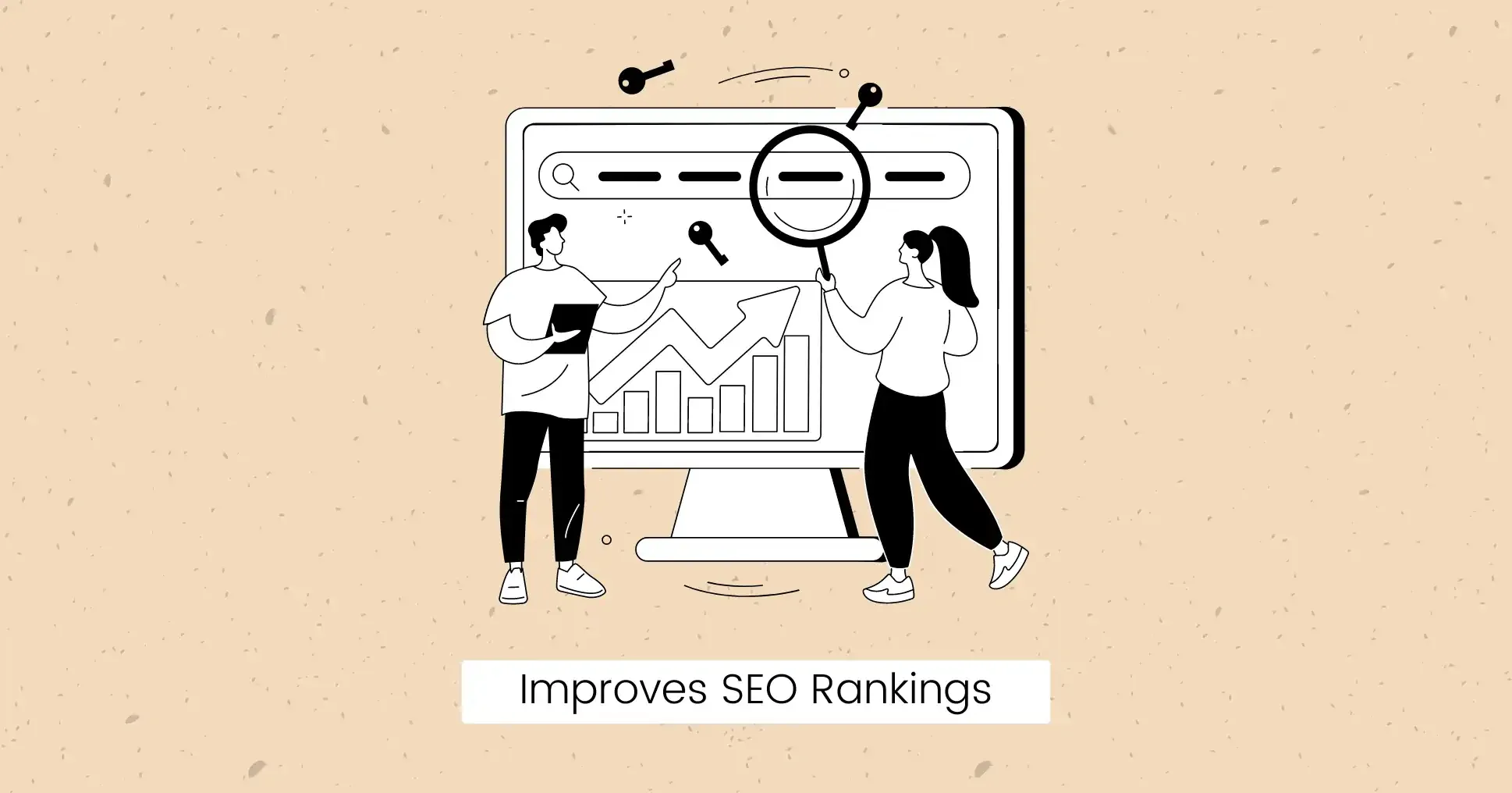
Poor design can negatively impact your search engine rankings.
Lower rankings mean less visibility and fewer visitors.
Quality design improves SEO, helping you rank higher on search engines.
Key Tips:
- Ensure fast loading times.
- Use responsive design for mobile devices.
- Properly structure content with headings and subheadings.
Mistakes to Avoid:
- Slow-loading pages.
- Ignoring mobile optimization.
- Poor content structure.
Example: Websites like Moz and Ahref utilize optimal design practices to enhance their SEO performance.
Increases Conversion Rates
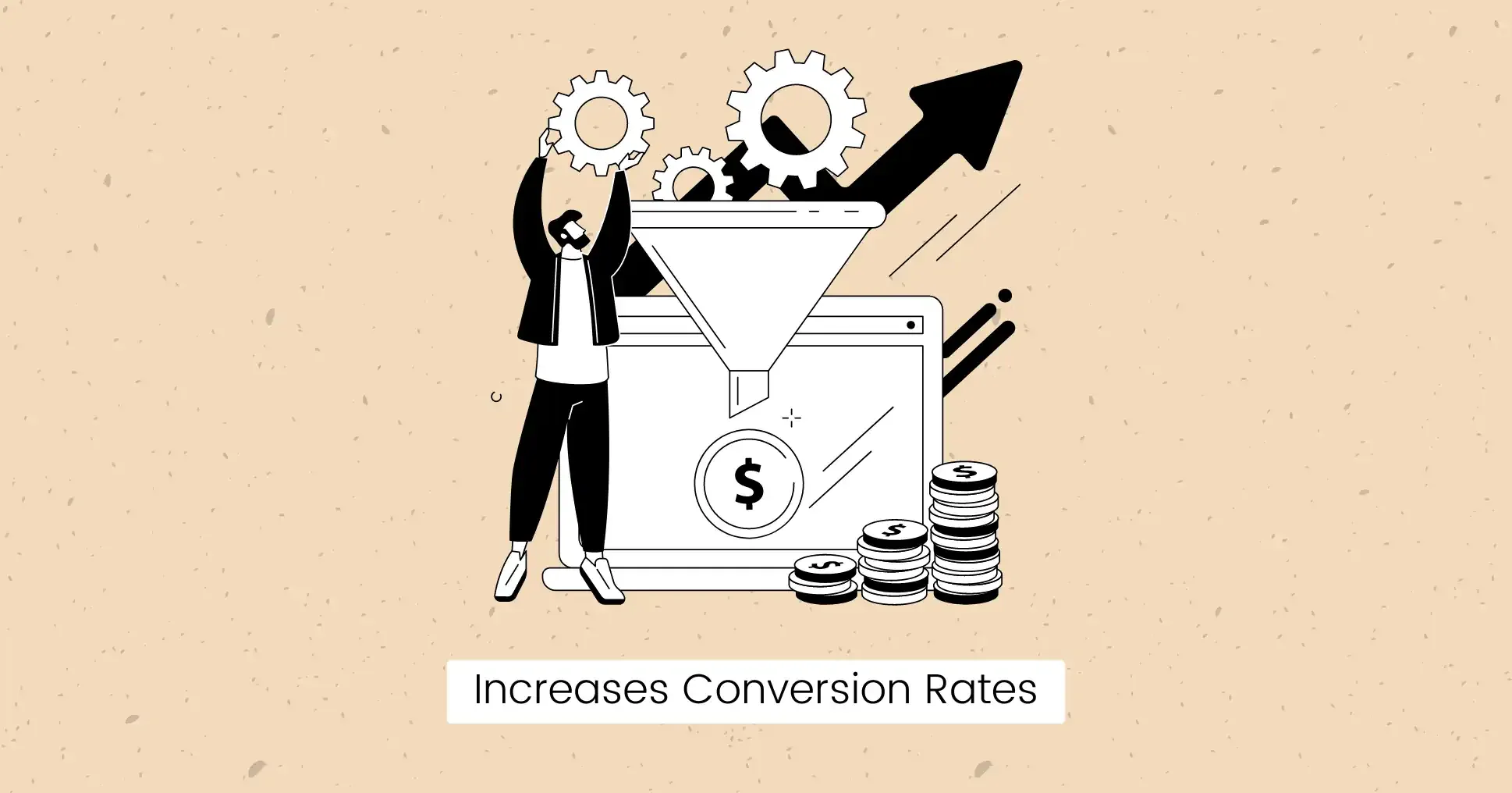
A poorly designed site discourages users from taking action.
Low conversion rates mean fewer sales or leads.
An attractive, user-friendly design encourages conversions.
Key Tips:
- Use eye-catching call-to-action buttons.
- Create a smooth checkout process.
- Highlight key benefits clearly.
Mistakes to Avoid:
- Complicated checkout processes.
- Poorly designed call-to-action buttons.
- Hiding important information.
Example: E-commerce sites like Shopify have simplified designs that make it easy for users to purchase products.
Supports Branding Efforts
Inconsistent design confuses users about your brand identity.
Confusion can weaken brand recognition and loyalty.
Consistent, high-quality design strengthens your brand’s identity.
Key Tips:
- Use consistent colors, fonts, and styles.
- Incorporate your logo prominently.
- Align design with brand messaging.
Mistakes to Avoid:
- Inconsistent use of branding elements.
- Ignoring brand guidelines.
- Overcomplicating the design.
Example: Facebook consistently uses its iconic blue color and logo, reinforcing brand identity.
Facilitates Social Media Integration
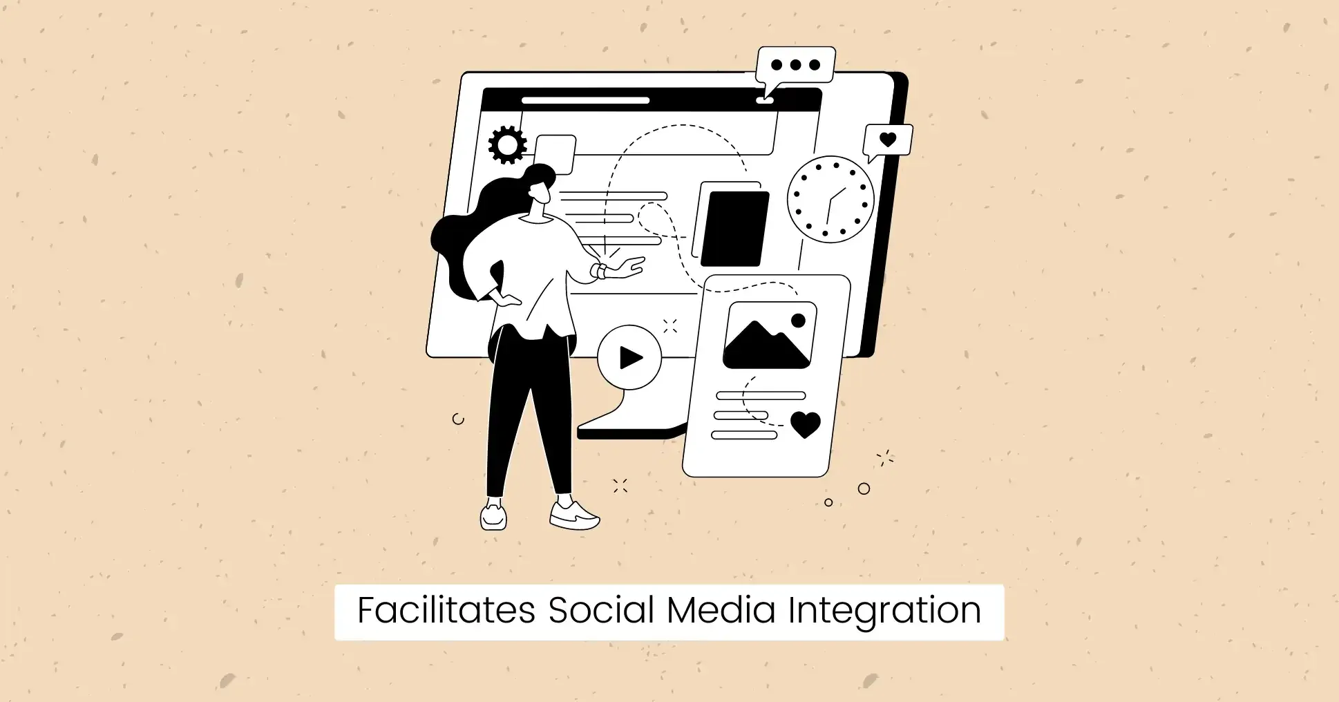
Poor integration with social media can limit your reach.
Limited reach means fewer opportunities for engagement and growth.
Quality design smoothly integrates social media and improves your online presence.
Key Tips:
- Include social media sharing buttons.
- Embed social media feeds on your site.
- Encourage user-generated content sharing.
Mistakes to Avoid:
- Overloading with too many social media buttons.
- Ignoring proper placement of sharing options.
- Neglecting to update social media content.
Example: Websites like WpBeginner effectively integrate social media sharing options, increasing content reach.
Provides Competitive Advantage
A bad design puts you behind competitors with better websites.
Falling behind competitors can lead to lost market share.
High-quality design gives you a competitive edge, attracting more customers.
Key Tips:
- Check and update your website design timely.
- Analyze competitor websites for inspiration.
- Focus on unique selling points in your design.
Mistakes to Avoid:
- Sticking with outdated designs.
- Neglecting competitor analysis.
- Copying competitors without adding unique elements.
Example: Innovative designs like Tesla’s website set it apart from traditional car manufacturers.
Improve Content Readability
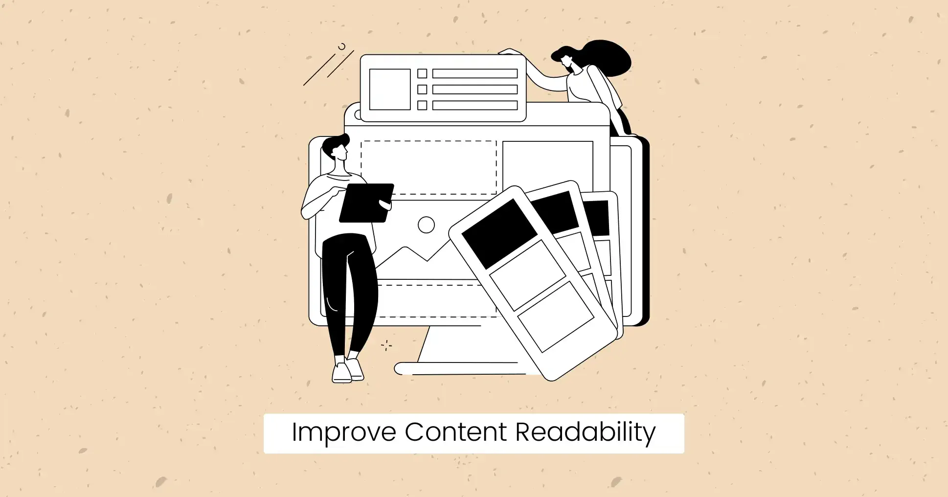
Poor readability drives users away from your content.
Low readability means users miss out on valuable information, reducing engagement.
A well-designed site improves readability, making content easy to consume.
Key Tips:
- Use legible fonts and appropriate font sizes.
- Break content into short paragraphs and bullet points.
- Use clear headings and subheadings.
Mistakes to Avoid:
- Using hard-to-read fonts or colors.
- Long blocks of text without breaks.
- Inconsistent formatting of headings and text.
Example: Blogs like Medium prioritize readability with clean layouts and easy-to-read fonts.
Supports Marketing Strategies
Poor design damages marketing efforts such as email campaigns or PPC ads.
Ineffective design reduces the impact of your marketing strategies, wasting resources.
Quality design complements and improves your marketing efforts, driving better results.
Key Tips:
- Design landing pages specifically for campaigns.
- Ensure consistency between ads and landing page designs.
- Optimize pages for quick loading times.
Mistakes to Avoid:
- Generic landing pages that don’t match campaign themes.
- Slow-loading landing pages due to heavy graphics or scripts.
- Inconsistent messaging between ads and landing pages.
Example: Companies like HubSpot create dedicated landing pages that align with their marketing campaigns for better conversion rates.
Final Words
Investing in quality website design is not just about aesthetics; it directly impacts your business success.
Avoiding common mistakes will help you stay ahead of the competition and ensure long-term success.
Do you need a website?
We create professional websites for small and medium-sized companies.

FAQs
How does website design support my marketing efforts?
Quality website design supports marketing efforts by creating landing pages according to specific campaigns. A well-designed site creates a positive first impression, building trust with visitors.
What role does content readability play in website success?
Content readability ensures that visitors can easily consume the information on your website. Good readability keeps users engaged, reduces bounce rates, and improves the overall user experience.
What is the importance of mobile optimization in website design?
Mobile optimization ensures that your website is accessible and functional on mobile devices. With increasing users accessing websites via smartphones and tablets, a mobile-friendly design is essential for providing a good user experience.